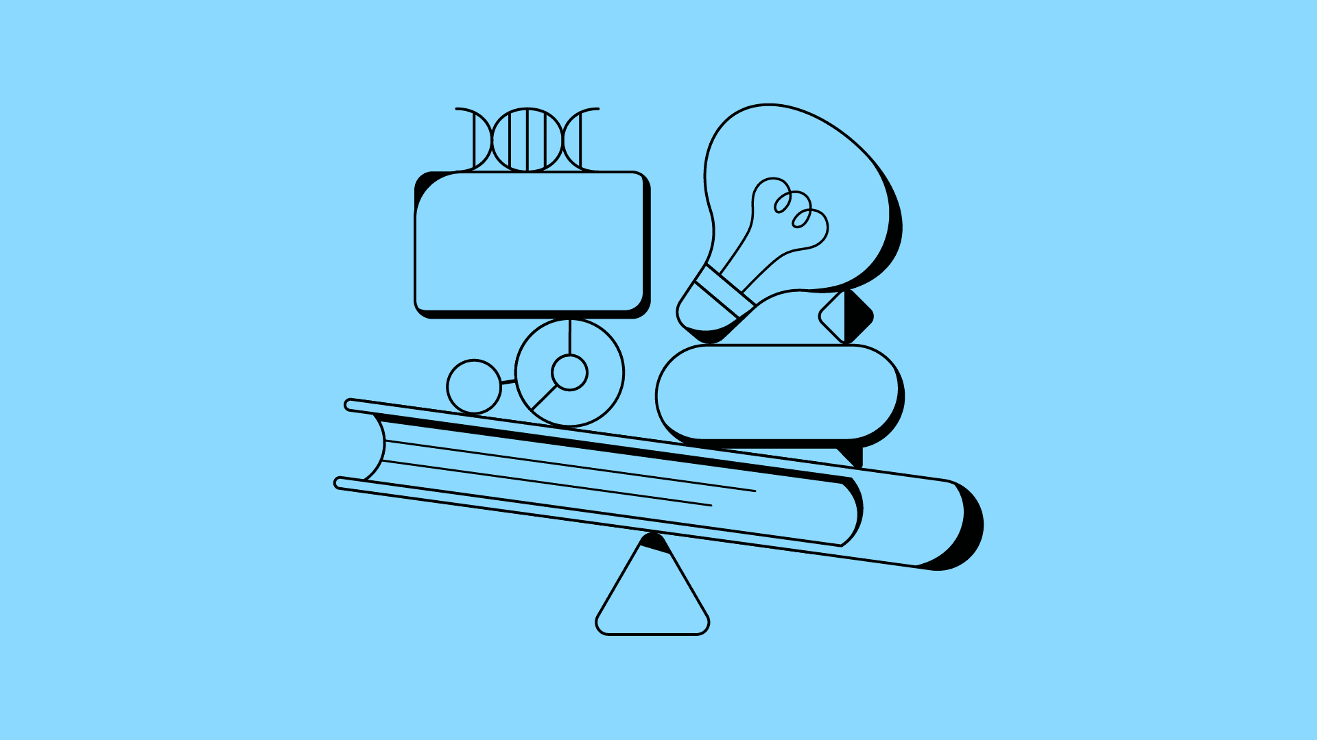
Enhancing communication effectiveness in presentations through animation: A case study of the Apple WWDC24 Keynote
9/3/24
Lienze Tsao
WWDC, short for "Worldwide Developers Conference," is a grand event hosted annually by Apple, attracting developers, designers, and tech enthusiasts from around the world.
The highlight of each WWDC is the opening Keynote on the first day.
Video below is the full Keynote:
During the Keynote, Apple showcases their latest software updates and product innovations. But how do they make a nearly two-hour-long Keynote engaging and leave a lasting impression on the audience? Animation plays a significant role in this.
"This is Apple. My product presentation doesn't need to be so flashy, right?"
If you're in the B2B industry like us, you might ask this question.
Apple's audience is general consumers, so it seems natural to present with interesting animations. But for products that are more technically complex or where the buyers aren't general consumers, it might not seem as important. Simple text descriptions should suffice, right?
However—
Even for B2B products, your presentation audience is still a human-being.
In the professional B2B domain, many believe that presentations should be straightforward and not overly embellished because they're dealing with professionals.
But this perspective overlooks a fact: decision-makers, engineers, doctors, or product managers are still influenced by the same psychological factors as general consumers. These include attention, emotions, and memory. This is why mixing animations with presentations is not only suitable for B2C but is equally effective in B2B communication.
What I want to emphasize is not flashy effects but rather focusing on the core concept: Effective communication and lowering the comprehension threshold.
After watching Apple's Keynote, I’ve analyzed and summarized 3 reasons why their Keynote is so captivating and offer some suggestions on how to apply these.
1. Holding the Audience's Attention
Why say "hold"?
Think about the environment during our presentations.
It's often in a dimly lit room, which is already makes people sleepy, and everyone has a smartphone—a notorious attention killer.
Once the audience is slightly distracted or feels the content isn't relevant to them, they quickly lose interest. Moreover, before you even get on stage, the audience might have already endured two hours of other speakers' presentations.
Apple's approach: In the nearly 100-minute-long Keynote, they include meticulously designed animations. The purpose of these animations is to ensure that the audience's attention remains focused on the presentation.
For B2B presentations, this is important. When dealing with complex technology or professional content, animations can break the monotony and keep the audience's attention on the key messages.
(Keynote 00:23:17) Through animation, the audience stays engaged in the presentation, complemented by verbal explanations to enhance communication effectiveness.
2. Creating Memorable Moments at Key Moments
Do you have unforgettable memories that have stayed with you for a long time?
Often, these are based on a specific image. That image must be special and impactful enough to leave a deep impression in your mind.
Our presentations might not be grand spectacles, but we can learn from Apple by using various levels of animation design. From simple UI animations to a few elaborate 3D animations, the contrast and variation in animation complexity are actually intended to create memorable moments.
It's important to note the balance in proportion.
Using too much animation effects is like highlighting an entire textbook, which is the same as not highlighting anything at all.
(Keynote 01:05:54) Apple Intelligence image animation. This is the climax of the entire Keynote, taking 24 seconds to perform and is the most intricately crafted part.
Apple's approach: By contrasting animation complexity, they leave a lasting impression on the audience with those complex and elaborate animations. For example, in this WWDC24, the Apple Intelligence that Apple wanted to emphasize was presented in a very refined animation lasting 24 seconds, creating a climax in the entire Keynote and imprinting a strong impression in the audience's mind.
3. Presenting Concepts More Directly
Many complex technologies or concepts are actually difficult to express in words.
For example, why do the biomedical industry or AI technologies often use images or animations to showcase? Because these concepts are hard to visualize, and the advantage of visualization is that it lowers the comprehension threshold. It also prevents the audience from misinterpreting or oversimplifying our product when translating text into images in their minds.
Apple mentioned the iPhone's Tap to Cash feature in the Keynote. If I were to describe this feature in text, it would be: two phones can transfer funds through a contactless transaction.
If you examine this text carefully, there are many ambiguities, such as: What exactly does contactless mean? How close must the phones be? How long does the transaction take? How do I know the funds have been transferred?
Apple's approach:
(Keynote 00:24:44) Tap to Cash live-action mixed with animation presentation.
Apple used this segment of video to straightforwardly and clearly present the Tap to Cash feature to everyone, while also highlighting Apple's refined brand quality through the glowing effects and number dissolution in the video, reinforcing the brand impression.
All of this couldn't have been achieved solely through textual descriptions.
⚠️ More is not better
Eating a piece of chocolate occasionally brings happiness, but eating a hundred pieces will make you sick. This is because of diminishing marginal utility, where a good effect becomes worse and might eventually have a negative impact. The benefits of animation are also subject to diminishing returns.
If an animation isn't needed, don't add it.
Too many dynamic elements can make the entire presentation lose focus. Even in Apple's presentations, there are many static frames used as a form of white space, allowing the audience's eyes and attention to take a break, avoiding visual fatigue.
So, before adding animation to your presentation, think:
Why should I add animation here?
Each design choice should be well-considered and deliberated to be persuasive.
After all, both animation and presentations are merely communication tools—
Effectiveness in communication is what matters most.
—
Adding animations to presentations makes it easier for our audience to understand and leaves a lasting impression. Like all techniques, animation requires practice to be used correctly at the right time and become a powerful tool for communication.
Feel free to contact us through the form to help your product presentations create more opportunities with animation.
By Lienze
Parable Pomelo | Animation Director | CTO
Other Perspectives


10 F., No. 6-7, Guangfu N. Rd., Songshan Dist., Taipei City 105035 , Taiwan (R.O.C.)
hi@parablepomelo.com
+886 2 25780223
VAT: 90580015
© 2024 Parable Pomelo Co., Ltd.
10 F., No. 6-7, Guangfu N. Rd., Songshan Dist., Taipei City , Taiwan (R.O.C.)
hi@parablepomelo.com
+886 2 25780223
VAT: 90580015
© 2024 Parable Pomelo Co., Ltd.
10 F., No. 6-7, Guangfu N. Rd., Songshan Dist., Taipei City , Taiwan (R.O.C.)
hi@parablepomelo.com
+886 2 25780223
VAT: 90580015
© 2024 Parable Pomelo Co., Ltd.